
")
")
")


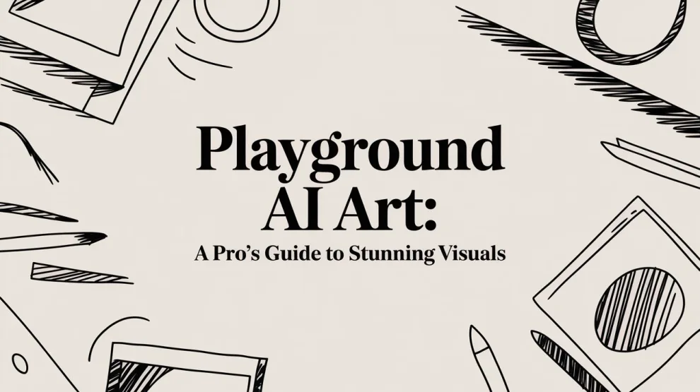
You’ve probably got a real deliverable sitting in front of you right now. A landing page needs a hero image. A product mockup needs visual polish before the next sprint review. A campaign needs ten ad variations, not one perfect poster. That’s where playground ai art stops being a novelty and starts acting like production infrastructure.
Image generation is often mistakenly treated like a one-shot creative trick. Professionals don’t work that way. They need repeatable prompts, editable outputs, fast iteration, and a tool that can move from rough concept to client-ready asset without making every revision painful. Playground AI fits that working style unusually well because it balances output quality with practical control.
It isn’t the most art-school tool in the category. It is, however, one of the more usable ones for people who ship things. Designers, marketers, founders, and product teams often care less about winning an aesthetic beauty contest and more about generating consistent visuals they can use across campaigns, prototypes, educational assets, and product surfaces.
Why Playground AI is Your New Creative Workhorse
If you need polished visuals this afternoon, the value of Playground AI becomes obvious fast. You can open the canvas, test a prompt, refine it, and move into editing without jumping across three separate tools. That matters when the job isn’t “make art.” The job is “deliver assets on time.”
Playground AI has grown to over 5 million registered users, with reported scores of 7.5/10 for artistic composition and 8.5/10 for technical accuracy, which is a strong signal for teams that care about dependable output rather than just stylistic flair, according to Aloa’s Playground AI vs Midjourney comparison. The same comparison notes that its free tier offers up to 15 free images every 3 hours, which makes it easy to test workflows before committing.
Where it fits in real client work
In practice, Playground AI works best when you need one or more of these:
- Campaign variation generation for social ads, email headers, and landing pages
- Concept art for product teams that need fast visual direction before formal design
- UI and marketing support assets like illustrations, scene backgrounds, or feature imagery
- Editable starting points that can be fixed with inpainting instead of regenerated from scratch
That last point is important. A lot of AI image tools are good at making one pretty image and bad at making a usable one. Playground AI is more forgiving when a result is almost right. For production work, “almost right” is often enough if the editor lets you correct details without blowing up the whole composition.
Why professionals keep it in the stack
Midjourney often gets attention for high-end visual style. Playground AI earns its place for a different reason. It behaves more like a workbench than a gallery wall.
Practical rule: Use Playground AI when consistency, speed of iteration, and editability matter more than squeezing out the most dramatic possible image.
That’s why it works for junior designers under deadline pressure and senior creative technologists building repeatable systems. It gives you enough quality to satisfy stakeholders, enough control to fix problems, and enough accessibility to scale beyond isolated experiments.
For teams building creative operations, that combination matters more than hype.
Your First Steps with the Playground AI Canvas
The first session with Playground AI should be boring in the best way. You want a short path from sign-up to output, not a maze of settings you don’t understand yet. The canvas is where that happens.

Start with the main working areas
Once you’re in, don’t click everything. Focus on four parts of the interface:
Prompt field
This is your instruction layer. Keep your first prompt plain and direct. Don’t try to write a masterpiece on the first pass.Model and style controls
These determine how the system interprets your prompt. Early on, your only goal is understanding that the same prompt can behave differently depending on model choice.Canvas or generation frame
The canvas or generation frame defines the working image area, similar to framing a shot before taking it.Image feed or history panel
This is your working memory. Use it. Good workflow means comparing versions, not relying on memory.
A junior designer often rushes to style presets first. That’s usually backwards. Start with subject clarity, then use styles to steer. If the prompt is weak, a preset won’t rescue it.
Your first image should be simple
Use a prompt that only asks for one clear thing. For example:
- Product-style image: “minimal ceramic coffee mug on a white studio background, soft shadow, clean commercial photography”
- Marketing background: “abstract blue gradient waves, modern SaaS website background, clean lighting”
- Illustration test: “friendly robot assistant, flat vector style, simple shapes, bright colors”
Keep the composition narrow. One subject. One style. One setting.
That first generation tells you three useful things at once. You’ll see how precisely the model follows your wording, how the selected style affects output, and whether the composition matches the frame you chose. If something feels off, change one variable at a time.
Use the canvas like a production tool
The fastest way to waste time is random experimentation. Instead, treat the first few runs like controlled tests.
- Change the prompt before changing everything else if the subject is wrong
- Change the style controls if the subject is right but the look is off
- Adjust the frame if the image feels cramped, cropped, or oddly balanced
- Save promising versions immediately so you don’t lose a direction that works
Don’t judge Playground AI from one generation. Judge it from your ability to get closer on the second and third try.
That’s the right mental model for playground ai art. The first output is usually a draft. The canvas becomes valuable when you stop expecting perfection and start using it to converge quickly.
A clean first-run workflow
Here’s the simplest sequence that generally works well:
- Write a plain prompt: describe the subject without fancy modifiers
- Pick a model: leave advanced settings alone for the moment
- Set a sensible frame: square for neutral testing, wide for headers, tall for posters
- Generate a small batch: compare, don’t overcommit to the first image
- Select one candidate: then refine prompt wording or move into editing
That approach builds confidence fast because it gives you feedback immediately. Once you can reliably get “close enough,” the advanced parts of Playground AI start making sense.
Crafting Powerful Prompts for Better Art
A weak prompt usually creates a review problem, not just an image problem. On a real client job, that means more rounds, more cherry-picking, and more time fixing outputs that were never pointed in the right direction. Playground AI performs best when the prompt reads like a compact creative brief.

Build the prompt in layers
For production work, I use a repeatable order. It keeps prompts readable, easier to debug, and easier to hand off to another designer or developer.
Subject
Start with the asset you need.
“cyberpunk cityscape”Descriptors
Add the visible traits and environment.
“neon lights, rainy streets, reflective pavement, volumetric fog”Style
Define the visual direction.
“cinematic lighting, futuristic concept art, Blade Runner-inspired mood”Technical cues
Add output guidance that affects finish and usability.
“sharp focus, detailed textures, high contrast”
That gives you a prompt like this:
“photorealistic cyberpunk cityscape, neon lights, rainy streets, reflective pavement, volumetric fog, cinematic lighting, futuristic concept art, sharp focus, detailed textures, high contrast”
That version is easier to refine because each phrase has a job. If the mood is right but the scene is too busy, trim descriptors. If the composition works but the finish feels generic, adjust the style and technical cues instead of rewriting the whole thing.
Compare prompts the way you would compare design specs
The fastest way to improve prompting is to rewrite vague requests into production-ready instructions. Strong prompts reduce ambiguity and make batch generation more useful because the outputs cluster around the same direction.
Weak prompt
“woman in a cafe”Stronger prompt
“editorial portrait of a woman in a quiet Paris cafe, natural window light, soft shadows, neutral tones, shallow depth of field, candid photography style”Weak prompt
“app dashboard illustration”Stronger prompt
“modern SaaS dashboard illustration on a laptop screen, clean UI components, blue and slate color palette, isometric perspective, product marketing style, crisp edges”Weak prompt
“t-shirt graphic with skull”Stronger prompt
“bold black-and-white t-shirt graphic featuring a stylized skull with roses, centered composition, high contrast, screen-print friendly, clean vector-like lines”
That last example matters for commercial use. If the output is headed for print-on-demand, packaging, or merch mockups, prompt for production constraints early. Terms like “screen-print friendly,” “limited color palette,” “clean vector-like lines,” and “centered composition” often save cleanup time later.
Negative prompts are part of quality control
Negative prompts do cleanup work before you open another tool. They help reduce recurring defects, especially when you are generating assets in batches for ads, landing pages, or product listings and need a tighter hit rate across multiple runs.
Use them to suppress problems such as:
- Soft details like muddy textures or smeared edges
- Broken anatomy such as awkward hands or uneven facial features
- Visual clutter from extra objects or noisy backgrounds
- Low-end rendering artifacts such as blur, distortion, oversaturation, or plastic-looking skin
A practical starting point looks like this:
“lowres, blurry, deformed, distorted, extra fingers, bad anatomy, oversaturated, noisy background”
Then tune it based on the job. For lifestyle portraits, anatomy cleanup usually matters most. For UI mockups and product scenes, clutter and warped geometry are bigger problems. For apparel graphics, I usually add terms that discourage gradients, photographic textures, or tiny details that will break in print.
Quick reference for style modifiers
| Style Category | Example Keywords |
|---|---|
| Photography | editorial, studio lighting, shallow depth of field, candid, commercial photography |
| Illustration | flat vector, children's book, line art, cel shaded, graphic poster |
| Cinematic | dramatic lighting, film still, moody shadows, anamorphic look, atmospheric |
| Product render | minimal background, soft shadow, glossy surfaces, clean reflections, high detail |
| Vintage | retro palette, grain, faded print, mid-century, analog texture |
Prompting for production, not play
For client work, do not improvise from scratch every time. Save prompt templates by use case. One for landing page hero images, one for editorial portraits, one for social ad variants, one for product visuals, and one for print-on-demand graphics. That template approach makes batch generation far more efficient because the team is testing variables, not reinventing the base prompt on every run.
This also matters if Playground AI is feeding a larger pipeline. Developers may trigger image sets through an API, marketers may need ten size variations, and designers may move only the best candidates into retouching. A documented prompt library keeps those handoffs clean.
If your team writes prompts across visual and non-visual tools, this guide on prompt engineering methods developers can apply systematically is a useful companion. The discipline carries over well. Clear instructions, controlled variables, and versioned prompt templates consistently save time.
Tuning Models and Parameters for Precision
A client review usually fails for one of two reasons. The concept is wrong, or the settings pushed a good concept into a weak render. Once the prompt is doing its job, precision comes from choosing the right model and making small parameter changes with intent.

Pick the model based on the job
Model selection is a production decision, not a style preference. Different models trade speed, prompt adherence, texture quality, and overall finish differently, so the right choice depends on what the asset has to do.
For rough exploration, use the faster path. It is better for checking layout direction, silhouette, and visual hierarchy without burning time on polished outputs you may throw away. For client-facing concepts, campaign art, or product images that may move into print-on-demand listings, switch to the higher-fidelity option once the direction is approved.
Playground AI’s v2.5 model was built with stronger color treatment, preference alignment, and documented guidance and step ranges in the Playground v2.5 paper on arXiv. That makes it a practical choice for work that needs to survive handoff into retouching, export, or batch production.
If your team is weighing speed, quality, and commercial fit across platforms, this AI image generator comparison for production use helps frame where Playground AI fits best.
Focus on the settings that actually change outcomes
Playground AI exposes several controls, but two usually do the heavy lifting in day-to-day work. Guidance scale controls prompt adherence. Sampling steps control how much refinement the model gets before it returns an image.
That sounds simple. The trade-offs are not.
Guidance scale
Guidance scale determines how strictly the model follows your prompt. Lower values leave room for interpretation. Higher values pull the model closer to your instructions.
In practice, lower guidance works better for moodboards, concept discovery, and art directions where atmosphere matters more than exact object placement. Higher guidance works better when the brief includes specific wardrobe, product details, brand colors, packaging cues, or a scene that needs to match copy closely.
Use it like a correction tool.
- If the model keeps drifting away from the requested subject, raise guidance a little.
- If the image starts to feel stiff, literal, or visually cramped, lower it a little.
- If a teammate says, "the prompt is right but the output feels forced," guidance is one of the first settings to check.
I avoid large jumps here. Small moves are easier to evaluate, especially if you are generating batches for review and need to explain why version B worked better than version A.
Sampling steps
Sampling steps affect how long the model refines the image. More steps can improve clarity and texture, but only until the returns flatten out.
For production work, this matters because steps cost time. If you are creating one hero image, a slower render may be acceptable. If you are generating dozens of ecommerce variants, social crops, or print-on-demand concepts, excessive steps turn into wasted hours and larger review queues.
A practical rule is to increase steps only when the failure mode points to under-refinement. Soft surfaces, muddy details, or incomplete textures can justify a bump. If the image is already structurally right and only needs cleanup, extra steps often do less than a targeted edit later.
A workflow that holds up under deadlines
For commercial work, I start with stable defaults and change one variable at a time. That keeps test rounds readable for both designers and developers.
A reliable pattern looks like this:
- Start with the model that matches the stage of the job.
- Set guidance in the middle of the recommended band.
- Set steps in the middle or slightly above it.
- Generate a small batch.
- Diagnose the failure before touching anything else.
That last point saves the most time. Teams often rewrite a solid prompt when the actual issue is weak parameter control. Or they push both settings upward at once, get harsher artifacts, and lose the clean version they already had.
Diagnose the image, then tune
Use the output to decide the next adjustment.
- Subject drift or missing requested elements: increase guidance slightly.
- Overcontrolled, unnatural, or rigid composition: reduce guidance slightly.
- Thin textures or unfinished detail: increase steps modestly.
- Artifact buildup after aggressive tuning: reduce the setting you just pushed.
This matters even more in automated workflows. If Playground AI is feeding an API-driven pipeline, batch generation script, or SKU creation process, loose parameter habits multiply quickly. One bad default can contaminate an entire set of outputs and create cleanup work downstream.
Precision comes from consistency
The best Playground AI results usually come from controlled settings, documented defaults, and clear reasons for every change. That is how you turn image generation from a creative experiment into a repeatable production tool.
For solo designers, that means saving parameter presets by use case. For teams, it means standardizing which model, guidance range, and step range apply to hero art, ad variants, editorial visuals, and print-on-demand graphics. Consistency makes reviews faster, API jobs easier to tune, and final assets easier to reproduce later.
Advanced Editing with Inpainting and Image to Image
A significant productivity jump happens when you stop regenerating whole images for small mistakes. Playground AI gets much more useful once you treat generation as draft creation and editing as the finishing stage.

Fixing one broken detail with inpainting
A common example is a portrait that works except for one hand. The face is right. Lighting is right. Composition is right. The hand looks strange.
That’s an inpainting job, not a full restart.
Here’s the workflow I use:
Mask only the broken area
Keep the selection tight. Don’t paint over half the image.Write a corrective sub-prompt
Something like: “natural human hand resting on table, realistic anatomy, soft window light”Keep the new prompt narrower than the original
You’re fixing a local issue, not redefining the whole scene.Run a few variations
Compare subtle differences. Pick the one that preserves the surrounding image best.
The key is restraint. If your mask is too large, the model starts rewriting nearby details you wanted to keep.
Using image to image for layout control
Image-to-image works well when you already know the composition you want. That could be a rough sketch, a grayscale blockout, a wireframe-like visual concept, or even a photo you want to stylize.
A product team might sketch a mobile app promo scene with a phone on the left, text space on the right, and background shapes behind it. Feed that structure in, then prompt for a polished marketing render. The result usually holds composition better than text prompting alone.
This is also useful if you’re applying an aesthetic transformation to something that already has layout logic. Instead of hoping the model invents the right arrangement, you give it a frame to follow.
If you want a broader sense of how AI stylization changes image character, this overview of AI image filter workflows is helpful.
A quick look at editing in motion
This walkthrough gives a good visual feel for how iterative editing behaves inside Playground AI:
Expanding an image with outpainting
Outpainting is what I use when an image is good but framed wrong for the final placement. Say you generated a strong portrait-oriented scene, then realize the client needs a wide website hero. Don’t throw it away. Expand the canvas and ask the model to continue the environment.
This works best when:
- the background has room to extend naturally
- the lighting is already consistent
- the scene doesn’t depend on tightly packed detail near the edges
A strong AI workflow doesn’t chase perfect first outputs. It preserves good work and repairs the weak spots.
That mindset saves hours. It also makes Playground AI feel less random, because you’re no longer forcing every improvement to come through full regeneration.
Integrating Playground AI into Professional Workflows
A client asks for 24 campaign visuals by Friday. Not 24 unrelated images. They need one visual system that can stretch across paid social, landing pages, email headers, and a sales deck without looking cobbled together. That is where Playground AI starts earning its place in a professional stack.
The shift is simple. Stop treating it like a one-off image generator and start using it like a production tool. In practice, that means batch generation, documented prompt patterns, and a review process that filters fast before anyone spends time polishing weak outputs.
Batch generation for marketing and design ops
Single-image prompting is easy. The true test is whether you can produce a consistent set without manually rebuilding the look each time.
For client work, I usually set up a controlled batch process:
- Write one master prompt with the art direction, lighting, framing, and brand tone locked in
- Change one variable per run such as product color, environment, or composition density
- Name outputs by test condition so the team can compare results without guessing what changed
- Shortlist first, edit second because cleanup time is expensive and weak candidates do not improve enough to justify it
That workflow works well for ad variant testing, blog header systems, app marketing concepts, and feature illustration sets. Playground AI is useful here because the canvas lets you keep working on selected outputs instead of exporting everything into another tool too early.
It also reduces a common team mistake. Designers often over-edit the first decent image they see, then discover the broader set has no consistency.
API thinking for product teams
Manual generation is fine for exploration. Product teams get more value when image creation is part of a repeatable pipeline.
A few practical use cases show up quickly:
- generating placeholder art for staging environments
- creating internal concept visuals from structured prompt fields
- producing branded variations for localization or personalization tests
- building simple internal tools where marketers request assets without writing prompts from scratch
The win is not novelty. It is reducing random requests and giving teams a system they can repeat.
If you are handing Playground AI off to developers, document your prompt schema the same way you would document design tokens. Define required fields, optional style modifiers, banned terms, aspect ratios, and review criteria. That keeps outputs closer to spec and cuts down on subjective back-and-forth.
Print-on-demand is a practical commercial use case
Print-on-demand deserves more attention than it gets. It is one of the clearest examples of AI image generation moving from experiment to sellable output.
The standard is higher than it looks. A graphic that works on a mood board can fail on a shirt mockup, a sticker listing, or a poster thumbnail. Edges get muddy. Fine details disappear. Contrast that felt dramatic on screen can print flat.
For POD work, I use a stricter checklist:
- Keep subject separation clean so background removal is possible without heavy manual masking
- Favor bold shapes over micro-detail because merchandise formats punish clutter
- Generate families of variants on purpose so one winning concept can branch into multiple SKUs
- Inspect for print issues such as awkward cropping, illegible text-like artifacts, and noisy texture
- Clean files before upload because marketplace-ready usually means more editing than the first generation suggests
Playground AI helps here because you can generate, simplify, repair, and resize in one working session. That matters when you are testing commercial viability, not just making something visually interesting.
When upgrading makes sense
Free access is enough to test the interface and pressure-test a few workflows. Professional use changes the math.
Upgrade once generation limits interrupt active projects, or when your team starts relying on repeated variations as part of normal delivery. At that point, the paid plan is less about extra features and more about throughput. If a marketer, designer, or developer is waiting on assets, delays cost more than the subscription.
That is usually the main decision point. Not whether Playground AI can make strong images, but whether your process can keep pace with client deadlines, campaign volume, and production review.
Playground AI FAQ
A typical team question sounds like this: the concept work is fast, but will Playground AI hold up once assets need approvals, revisions, and delivery dates attached to them? That is the right question. For professional use, the actual test is throughput, editability, and rights review.
Is the free plan enough for serious work
It is enough to test fit. It is rarely enough to support a repeatable production workflow.
Free access works well for prompt testing, model comparison, and early concept exploration. The limit shows up once a designer starts running variations in batches, art-directing around stakeholder feedback, or fixing weak outputs through multiple passes. In client work, those extra rounds are normal.
If your team treats image generation as part of daily delivery, generation caps become an operations problem, not just a pricing detail.
When should you upgrade
Upgrade once limits start changing how you work.
Good signals include:
- Prompt exploration gets cut short because the team is saving generations
- Revision cycles slow down during campaign, sprint, or launch weeks
- Inpainting and cleanup become standard steps instead of occasional fixes
- One approved concept needs many variants for ads, landing pages, social crops, or POD listings
That is usually the break point. Paid access makes sense when faster iteration costs less than the hours lost waiting, regenerating, or splitting work across tools.
Can you use Playground AI for client and business work
Yes, but only after checking the platform’s current terms for the account and plan you are using. Licensing and usage policies can change, and commercial use is one area where teams should avoid assumptions.
My rule is simple. Review rights before the first client-facing concept leaves the team. If the image is headed toward packaging, ads, a product page, or print-on-demand, confirm usage terms at kickoff and save a copy of the policy date in the project notes.
That takes very little time and prevents messy conversations later.
What about moderation and blocked prompts
Playground AI applies content moderation, so some prompts will fail or need rewritten language. Regarding moderation, the practical issue in client work is not usually shock content. It is legitimate requests that contain sensitive wording, medical references, or scenarios that look risky to automated filters.
Handle that with prompt versioning. Write one direct prompt, then keep a second version that describes the same scene with safer wording and clearer visual constraints. Teams that do this waste less time than teams waiting on one exact phrasing to pass.
Is Playground AI better for final assets or drafts
It is strong for draft generation and still useful for finals, but only if you treat the first output as source material.
The production pattern is straightforward:
- generate a base set
- pick the image with the best composition, not the flashiest detail
- repair local problems with inpainting
- adapt aspect ratio and framing for the final placement
- finish typography, color correction, or export prep in the rest of the design stack
That workflow is why playground ai art fits professional use. It shortens the path to a usable asset, especially when paired with batch generation, structured review, and downstream cleanup.
If you’re building AI into design, product, or marketing work, AssistGPT Hub is worth keeping in your research stack. It’s a practical resource for comparing tools, learning workflow patterns, and figuring out how generative AI fits real business execution instead of just demos.


")
")
")
")
")
")
Add Comment